

The Department of Treasury’s website is overwhelming and crowded with information making it difficult for everyday American’s to access the variety of resources available.
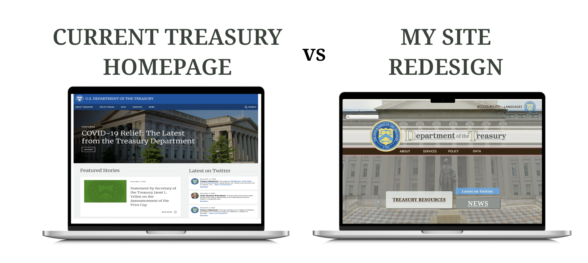
In my redesign I focused on sorting information in creative and friendly ways that guide the User directly to the tools they need to better their quality of life. The bulk of my time was spent Card Sorting and developing an information architecture that better contains The Treasury’s rich library of information without completely overpowering the everyday User.
The Department of Treasury website is OVERWHELMING! It’s full of confusing jargon that make it accessible to ONE specific kind of User. It’s hard to read AND it’s difficult to find what you’re looking buried within the large blocks of text that crowd the website.
Redesigning the site with the AVERAGE American in mind and re-organizing the site into two broad content categories ie; Resources for YOU! Resources for YOUR Business. Will make the site less crowded and help User’s find what they need faster than ever.
For this Project I was the primary User Experience Researcher as well as the Interaction Designer. I conducted every round of interviews and analyzed the data, I used this information to inform and iterate on my design. In the final round of design iteration I created design animations that organized content in a friendly and innovative way.
This was an independently produced project created without any stakeholder input. Given the opportunity to work in this way I took many risks and aimed to make my design as innovative as possible. In the real world... or if I were working in a professional capacity with the intention of launching this site immediately, I would have approached almost all of my design choices differently. This is all to say please view the choices I made with this in mind. They reflect a desire to push boundaries and think about what might be possible when designing Gov’t and all websites someday.
I began with a Proto Persona.
When imagining this person I wanted to focus on someone like me, and many other Americans. Someone who is not the MOST financially literate and savvy but who strives to understand how and what to do with their money.
Because I was focused on this kind of user I chose to analyze the user path to the auctions page.
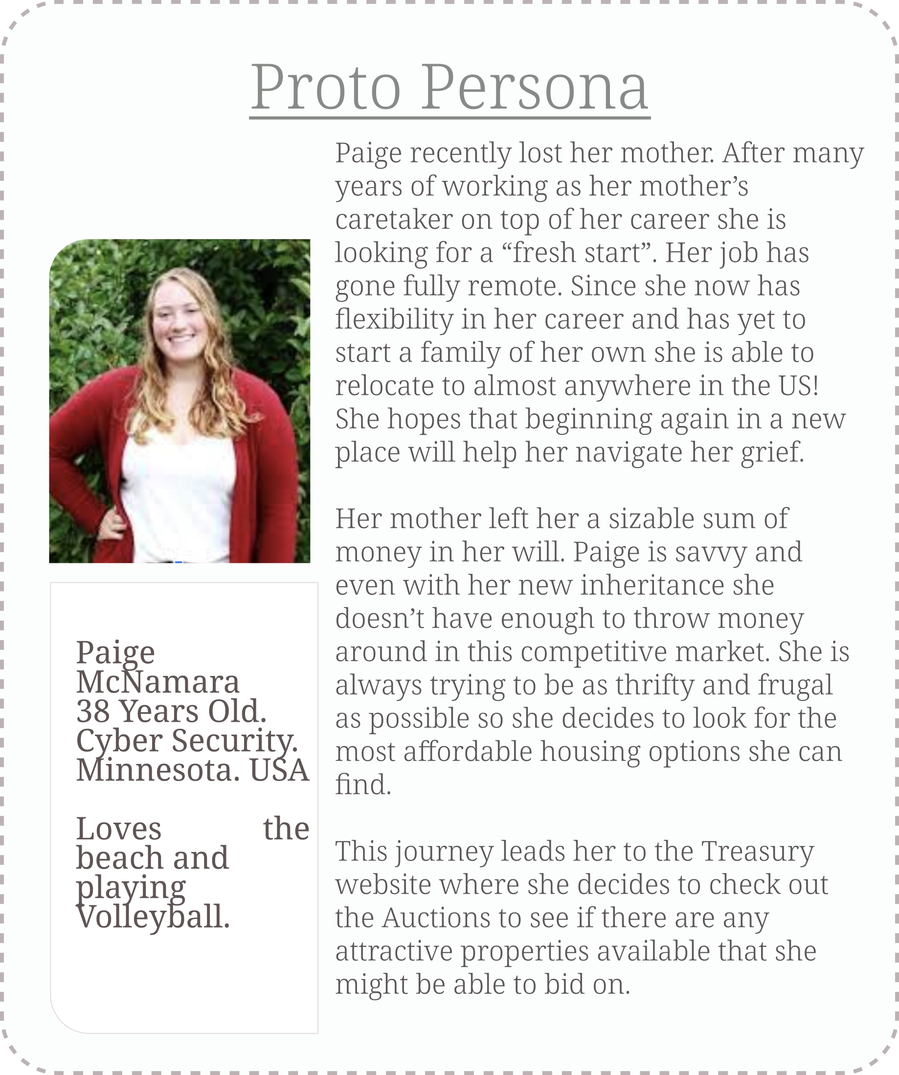
I chose this route because it’s something that almost any person could follow. It is straight forward and easy to understand unlike many of the other pages which require previous knowledge about how money operates to comprehend what you’re looking at.
After I established my Proto Persona I started doing a detailed analysis of the path this User would take when navigating to the Auctions page. This path presented an extra challenge because the Auction pages lack any kind of cohesion with the rest of the Treasury site. You feel like you’ve entered a completely different site that hasn’t been updated in decades.
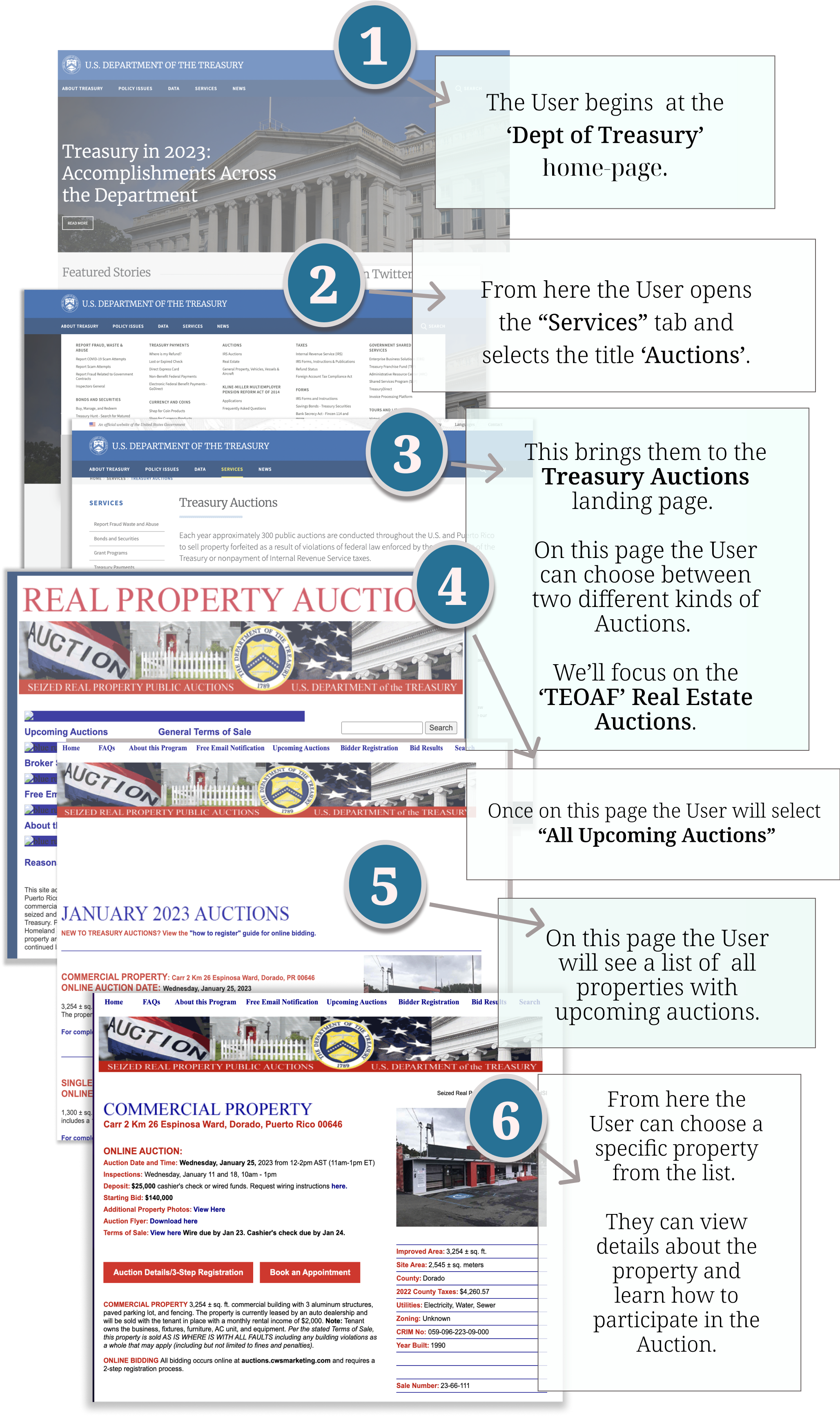
With my User Path well established I began conducting interviews.
I asked the User’s to freely explore the site at first before asking them to find the Auctions page and peruse properties.
During these User Interviews I sought to understand what was working about the CURRENT Department of Treasury’s web design.
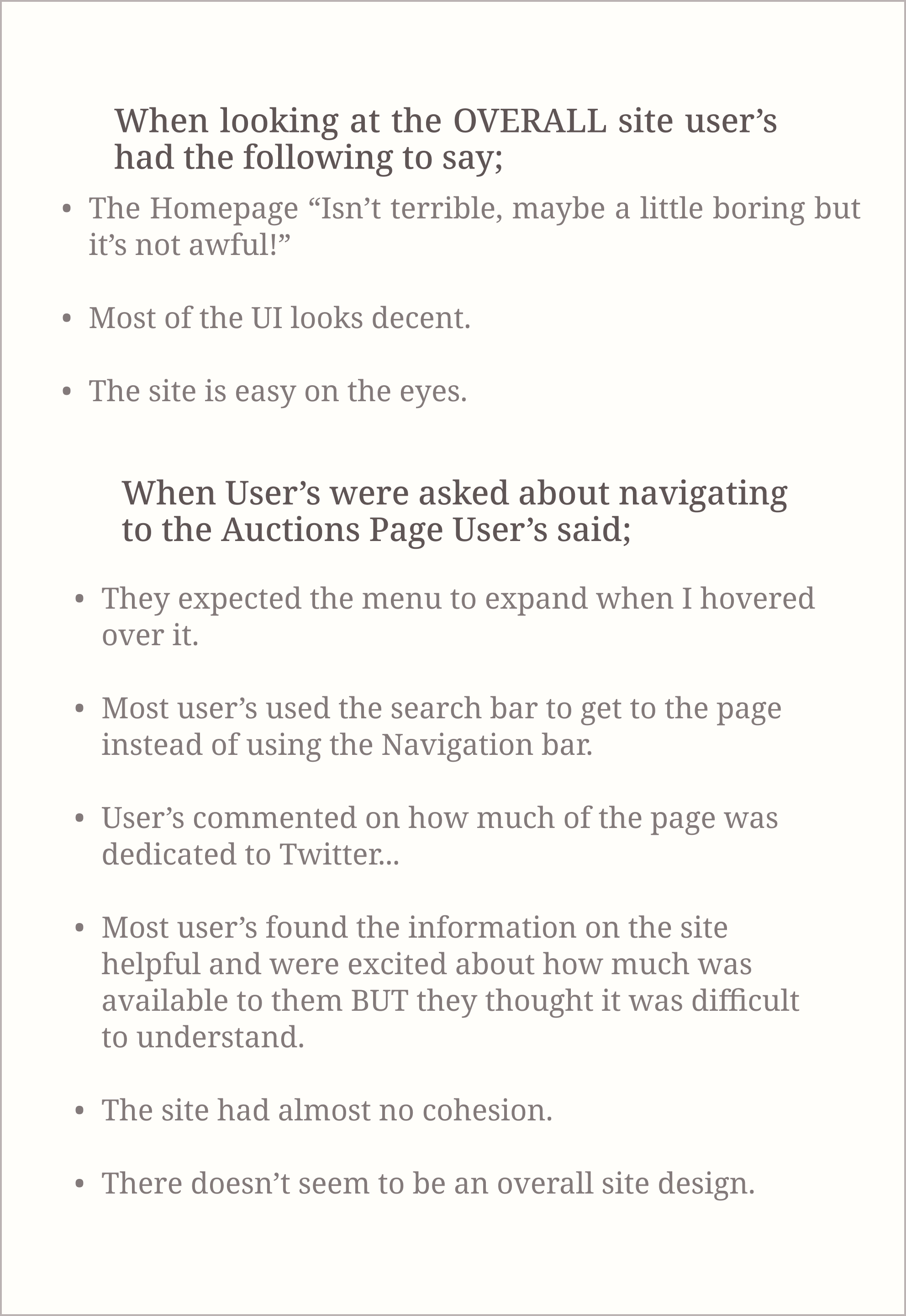
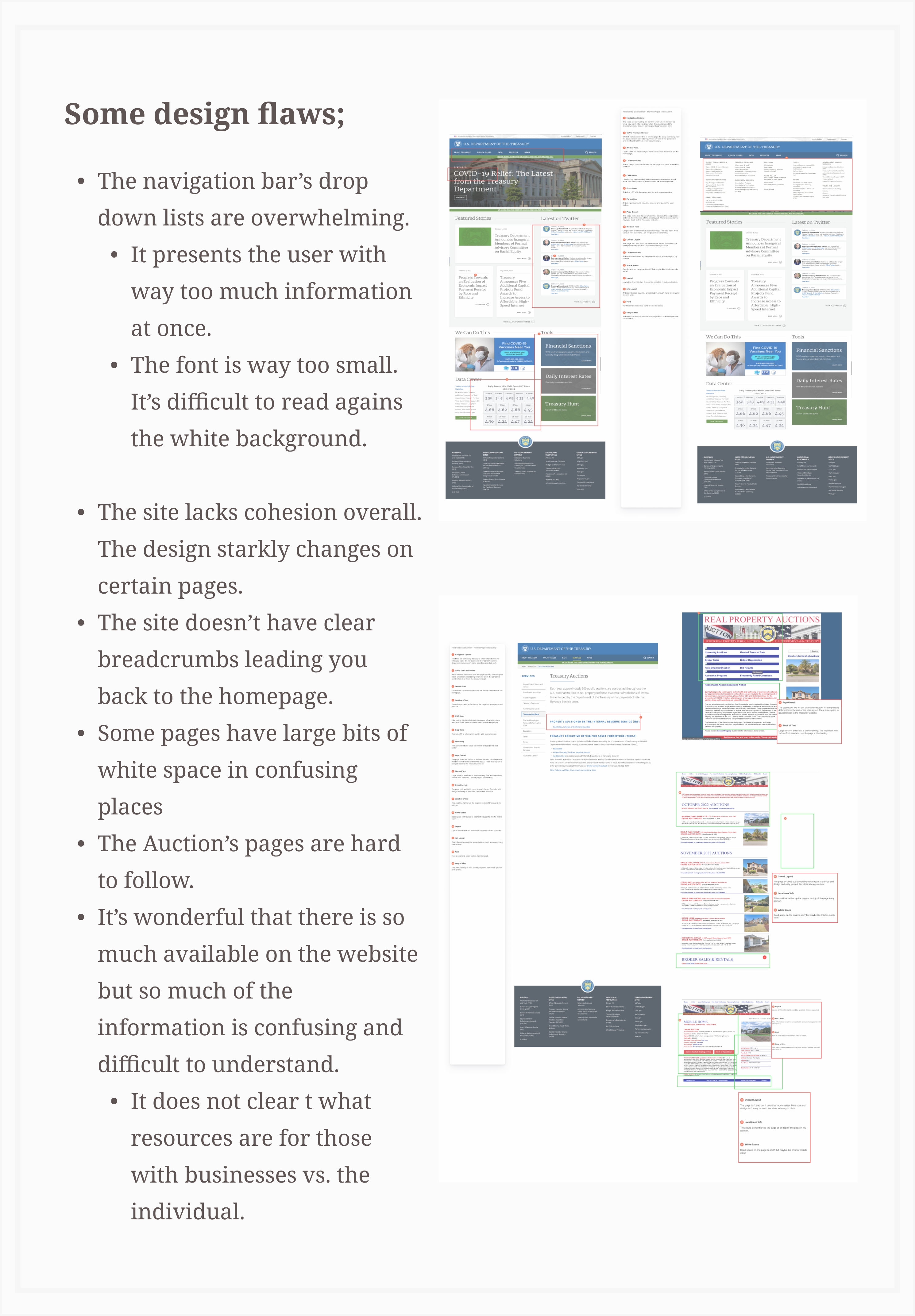
After committing to a User Path I did a detailed Heuristic evaluation of the webpages visited along the User’s Path. As noted in interviews the overall layout of the homepage works pretty well! There is a nice use of black space and elements are clearly grouped together in a way that makes the site easy to scan.
Because the purpose of this REDESIGNING The Department of Treasury’s current site I moved on from research and analysis rather quickly so that I could have ample time to iterate on and solidify my design.
I began this leg of the journey by developing a MoodBoard in Invision.
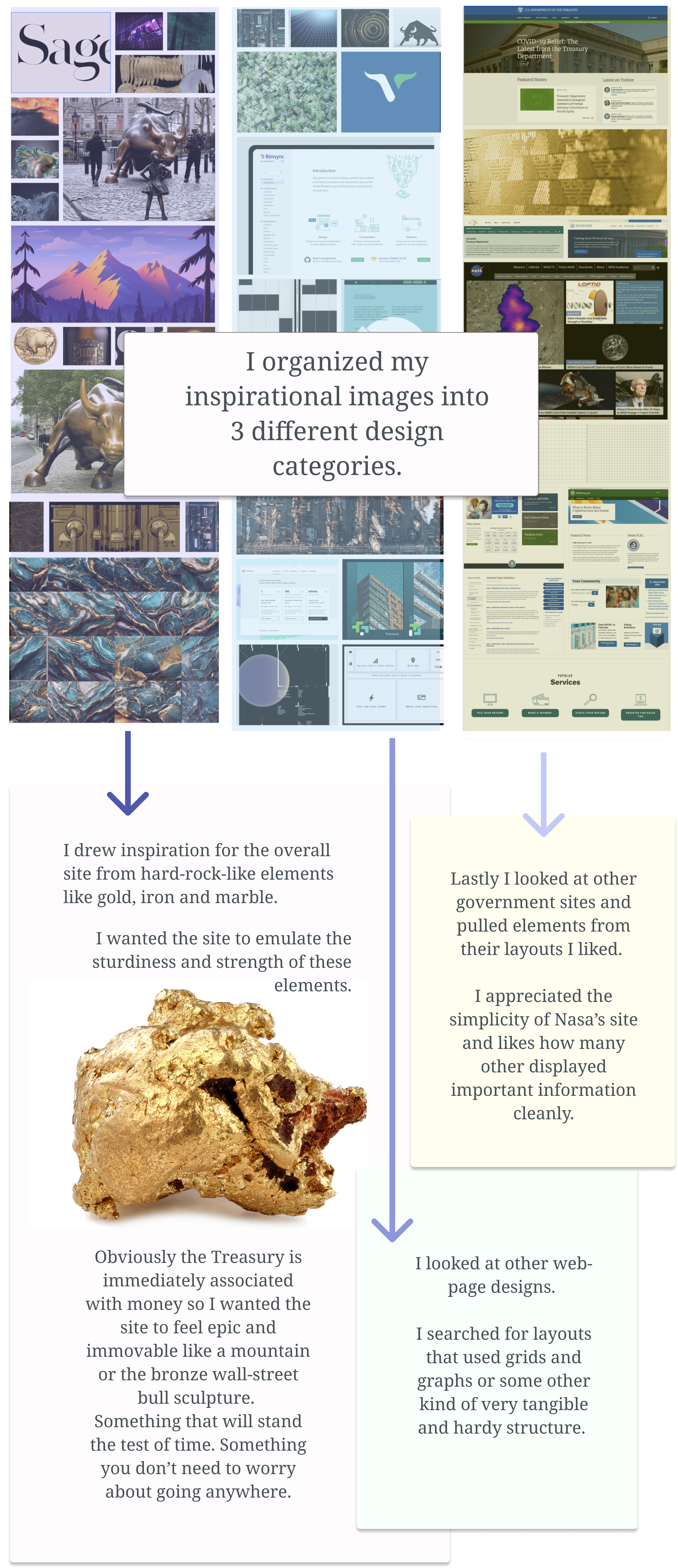
I aimed to communicate to the User that the site is secure and trustworthy because finances and can be such a painful subject to broach especially given the economic uncertainty of a post pandemic world.
I started to dig into the nitty gritty of reorganizing the sites layout. I began with evlauating the navigation. The biggest issue by far is the amount of content and the size of the type. In the image below you can see a good example of what I mean.
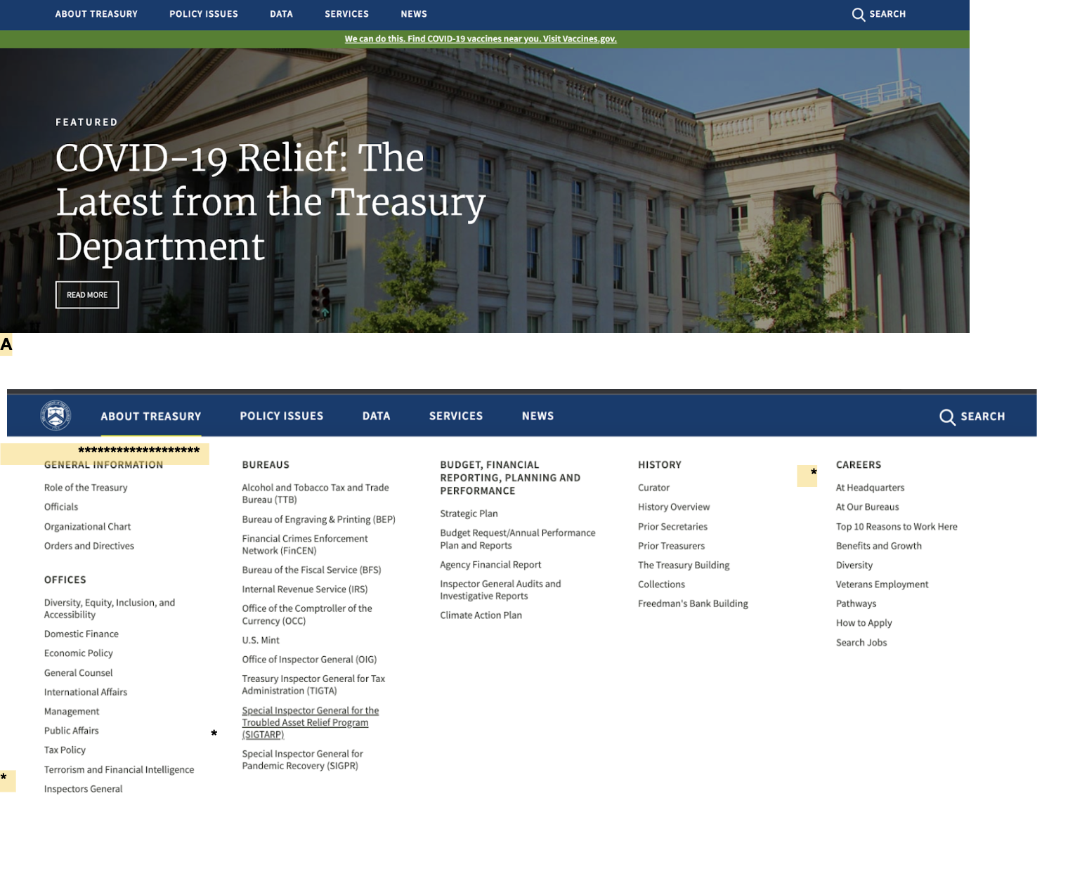
I did a full evaluation of the Navigation. You can view the full evaluation here.
After spending time making notes on the site's set up I conducted a round of usability tests. I hoped I could make additional changes based on User's feedback. For the most part the feedback I got was much the same as my thoughts.
Some User's found items on the menu easily and others had a hard time knowing where to go when looking for the auction page. The use of the term "services" threw some users. Most Users commented they expected the nav bar to drop down when rolled over.
A direct quote from one user;
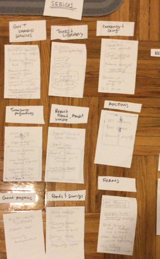
My next step was writing notecards with each header and subheader on it. I organized and reorganized these cards to find the most optimal information hieratchy I got guidance from my mentors at this step to help me further condense the site's contents. With the assistnace from my colleague I was able to condense the expansize navigation down into major catagories like; PAYMENTS, REPORTS and DATA.
Once I felt like I had sufficiently examined the current site and re-organized it's contents I moved onto actually redesigning.
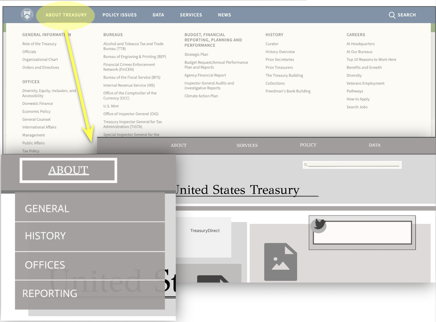
I began with wireframing the Navigation. I changed the menu so that it dropped down. You can see in the above image I was able to boil the MASSIVE amount of information into a few header catagories.
I tested my navigation design with Users before moving further into prototyping.
Overall the feedback wav very positive. I did gain some important insights that helped me better design a responsive site.
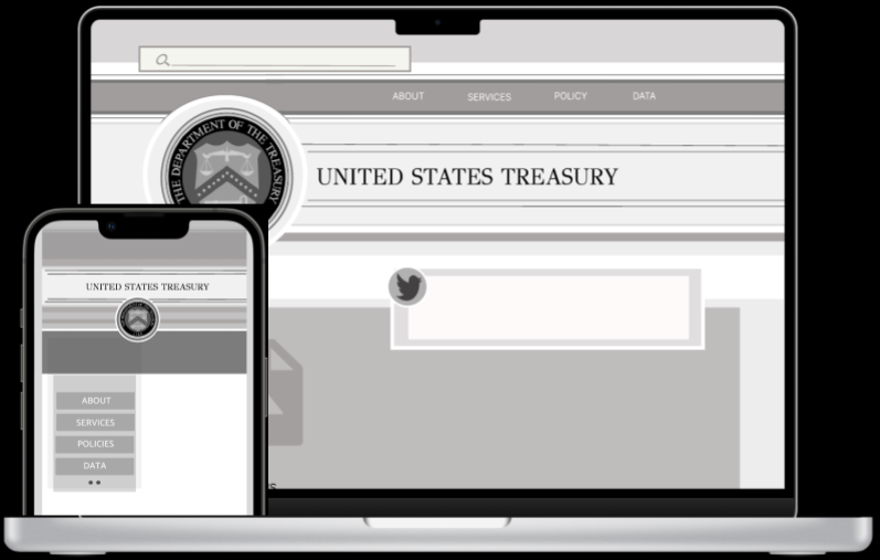
I moved onto wireframing the rest of the site but I did spend a lot of time iterating on the Navigation before settling on a final design.
Above you can see a final iteration of my wireframe design. I took a long time to settle into this design. I had hoped that having a well laid out blue print would make further deisgning easier.
You can view the interactive prototype here
Before I started to get deeper into the design process I developed a preliminary Style Tile.
You can seee below I added a lot of elements and colors- not all of them ended up being used in the final design.

For inspiration I was drawn to things like strong architecture that featured columns and other bold-solid designs.
I liked the idea of mimicking stone and other hard rock elements in the design to bring to invoke a feeling of security.
I made a desicion early on that I wanted to take a lot of risks with this deisgn. I didn't want to be afraid to "be ugly" or take chances. I felt like I had a unique opportunity to play and explore since I didn't need to work within specific stakeholder demands.
At this phase of the process I was iterating, iterating, iterating.
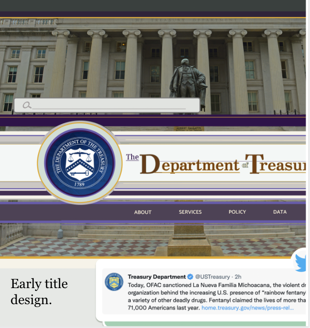
I started out using a lot of this purple color because I'd hoped it'd communicate wealth and abundance. I wasn't super happy with how the colors were coming together despite all my attempts at working them into the design. On top of my hesitation my mentor encouraged me to move away from purple because it can sometimes cause a feeling of unease amongst users.
I definitely didn't want the site to give any inkling of uncertainty or lack of trustworthiness so with that note I scrapped the purple and began playing with different color pallets.
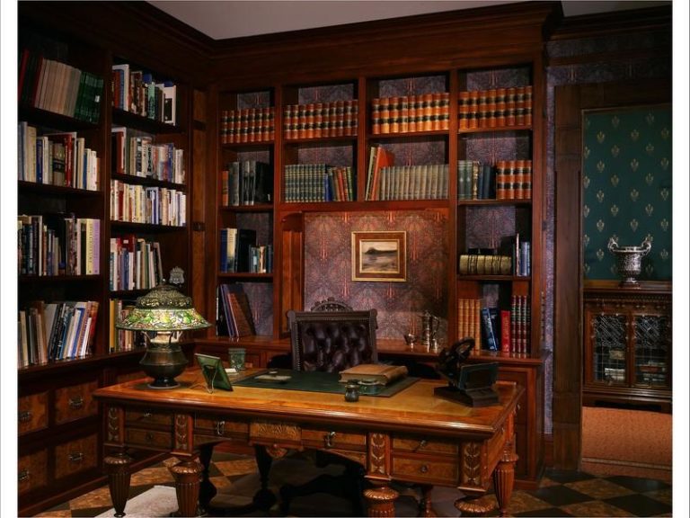
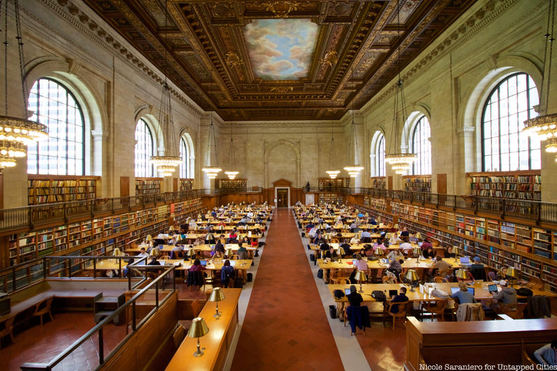
As I continued on my design journey I started to solidify some design themes.
I wanted to emmulate the architecture of traditional buildings like the New York public library.
For the overall "feel" of the site I looked at a classic, upscale Law Office- think Richard Gilmore.
As I was iterating I was taking in and noticing design in the world around me. On my way home one afternoon I noticied the Lincoln Center Subway sign and snapped a photo of it to draw inspiration from.
So much of my design process was spent iterating.
Below you can see some of the many iterations I went through. They were not all pretty!!
But they were all a part of the process.
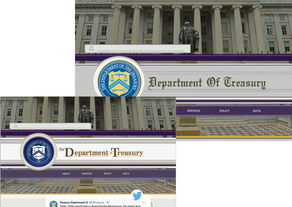
I played with colors and styles and tried a lot of different things because I wanted to push boundaries. Throughout this process I did a lot of casual testing amongst friends and mentors and I frequently asked for feedback while I worked towards my final design.
I made many small changes based on peer reviews.
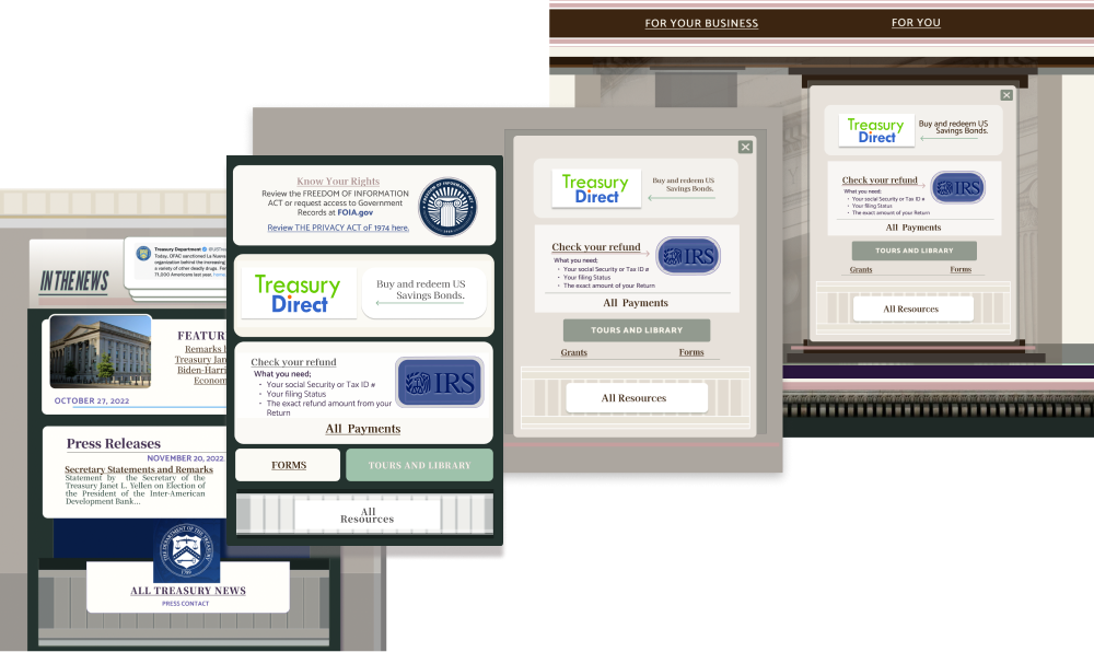
Early on I was playing with large ornate page breakers that I wanted to use like the elaborate window dressings you see on pre-war buildings. This ultimately didn't work and confused users so I removed it.
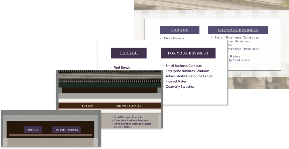
I continued towards finding a theme using columns, inspired by the front of the Department of Treasury building. I ended up using images of the Treasury building throughout the final design.
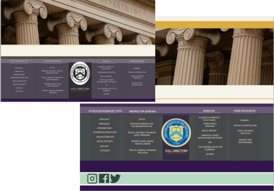
In my final leg of designing I added animations to the homepage and fleshed out my mobile design. I wanted to push myself and my skills and give myself a real challenge. I also wanted to think about organizing content online in new and interesting ways than we typically see.
Take a look at how the final desktop and mobile design turned out.
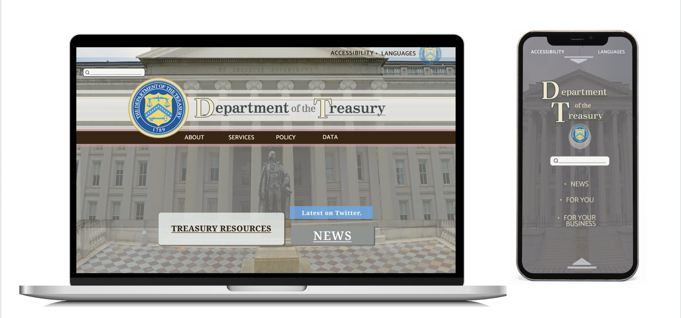
Explore these High-Fidelity prototypes on FIGMA!
Thank you for taking the time to review my case study, as I hope you can tell a lot of hard work and love went into putting it together for you! If you have questions or would like to connect you can find my contact info below.