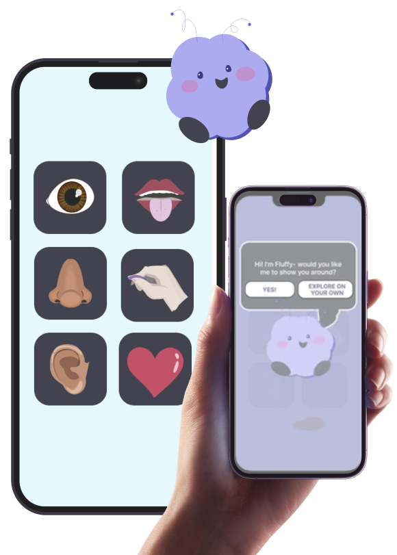
LIFT UP! provides an escape from the non stop hustle and stress of life in 2023 by lighting up the Users brain in creative and unexpected ways. We hope to help them feel more in their body and less exhausted by engaging them with their 5 senses for short bursts during their busy days..
Folks struggle with mental health more than ever in a post pandemic world.
People with busy lives who struggle with anxiety get overwhelmed by traditional solutions like meditation or exercise.
They’re burnt out from responsibilities but have trouble unwinding in their freetime.
LIFT UP gives YOU(the user) a chance to enjoy short bursts of serotonin!
By providing a library of welcoming multi sensory experiences, LIFT UP, brings you into your body via your 5 senses(site, smell, taste, touch and hearing).
Giving you a much needed break from your busy life to reconnect with yourself and calm your mind.
In this project I wore many hats but I primarily played the role of Project Manager, I kept our team on track and on top of deadlines while filling in whatever gaps my teammates missed or did not have time for along the way.
I conducted interviews, organized research results, created initial paper prototype sketches and played a key role in the ideation and design process.
ALL of the Hi-Fidelity Prototypes you see in this Case Study were created by me!
Our Journey building Lift Up started with a team brainstorm. After a few minutes we shared ideas and noticed ALMOST ALL of our concepts centered around mental health and general wellbeing in some way.
This made narrowing our list and picking an eventual focus easy because as a team our hearts were all in the same place.
Our initial idea was pretty broad overall- we decided to focus on something that would give user’s a BOOST of ‘good vibes’!
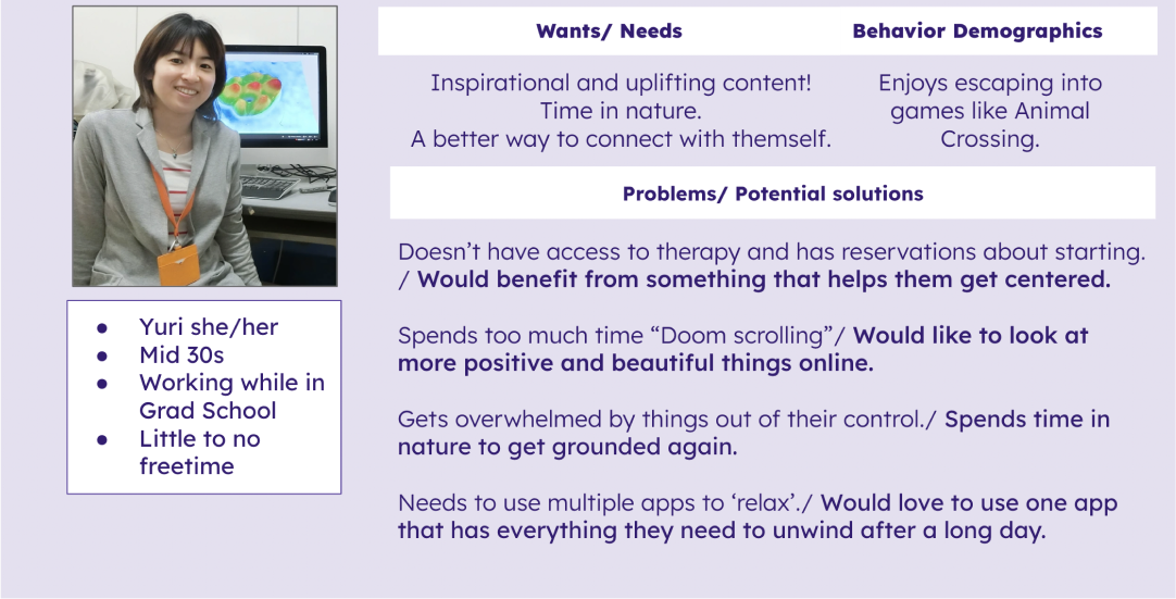
When imagining our person we hypothesized they’d be someone with limited free-time- possibly a student or working mom- who has trouble “winding down” when FINALLY done working.
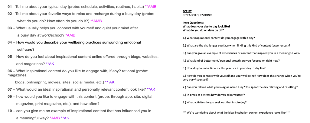
In crafting user interviews our team focused on HOW, WHEN and WHY user’s relaxed or gained inspiration in their day to day lives.
We individually came up 5 or so questions each to pull from. Then as a group we voted on the ones we felt were most effective. This helped us come up with 10 questions to get at the heart of what users need most to feel relaxed and inspired whenever burn out sets in.
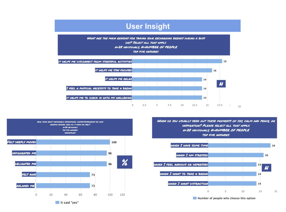
We also curated a survey that over 40 people completed. Our Team’s research lead organized the results into the following graphs for us to examine.
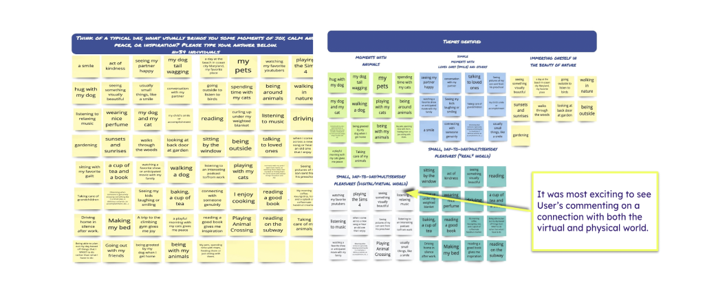
We were most excited to see so many insightful consistencies among User’s replies. We got so excited to see the overlap of “real world” and digital experiences. We were also pleased to see how much inspiration and joy users find in beautiful things.
This insight really inspired us to pursue a multi-sensory multi reality virtual experience.
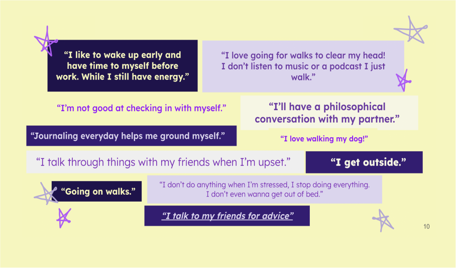
When organizing the results of our face to face interviews we saw similar patterns.
In the collection of quotes above you can see most Users spoke about getting outside, talking walks and talking to friends when needing to destress.
We took information directly from our interviews to create our User’s Empathy map.
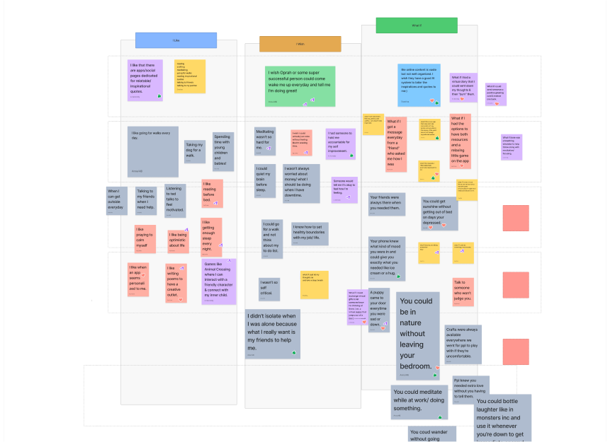
We started ideating with an I like, I wish... What if... exercise and came up with an array of features.
We spent a lot of time ideating! We had no shortage of ideas for features.
One of our “What ifs...” imagined if you could bring nature and sunshine into your room on days your depressed or struggling to get out of a funk. This was a step closer to solidifying the Multi-Reality feature that would make up some of Lift Up’s experiences.
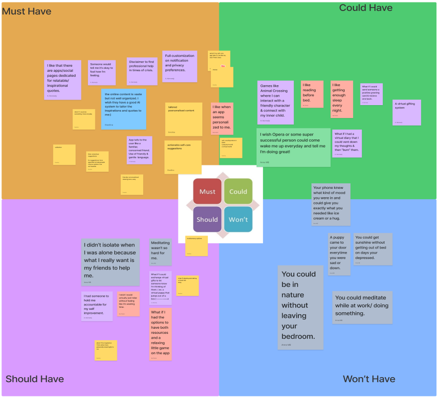
We organized our iterations in what the app MUST HAVE, COULD HAVE, SHOULD HAVE and MUST HAVE. At this phase of iteration the primary our team was discussing was a text message from a “a friend”.
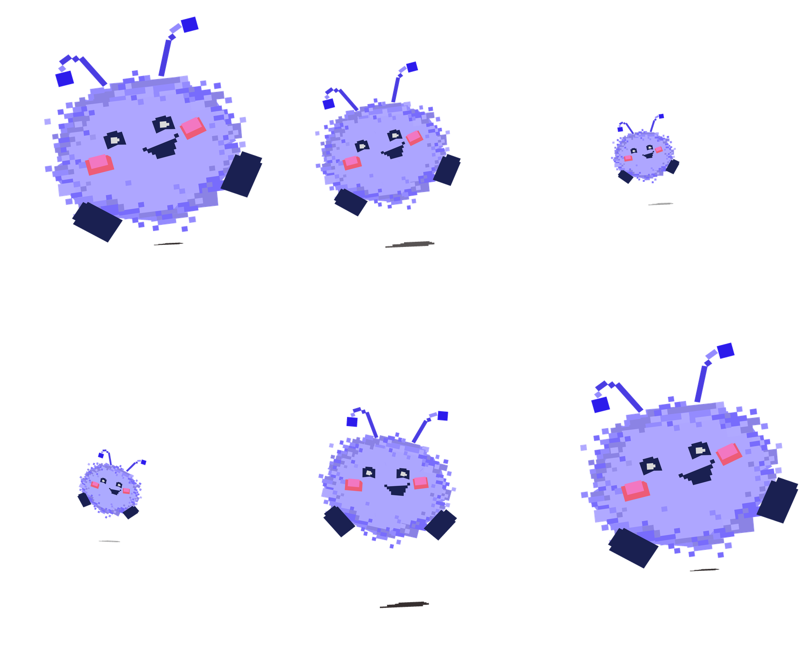
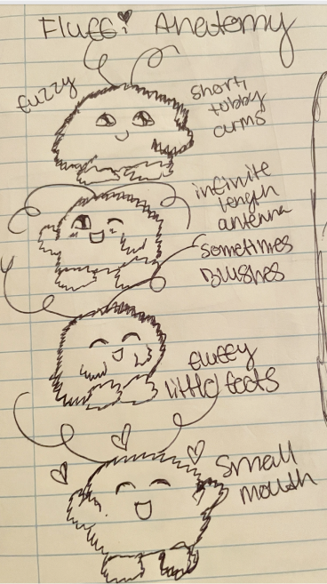
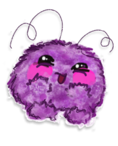
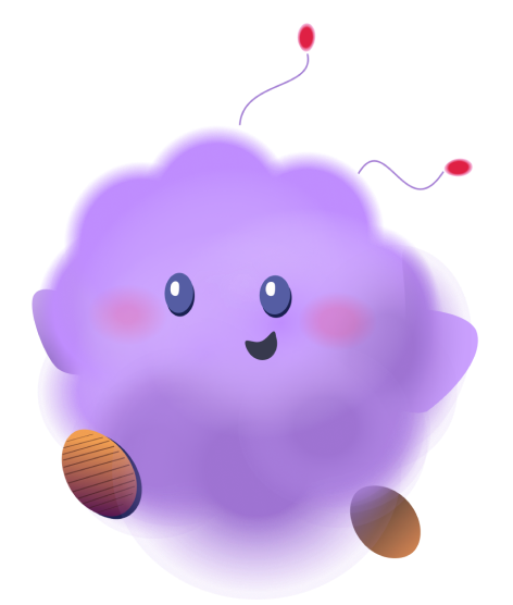
We liked this idea initially because so many users mentioned they feel most comforted by their friends when they were stressed. This is where our mascot “Fluffy” was born! We thought having an adorable character checking in on or guiding the user would make Lift Up more welcoming.
At this stage of iteration we also spoke about having a message directing the user to mental health resources.
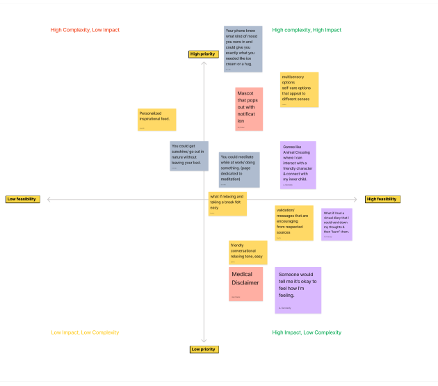
We organized our iterations and User insights into the value proposition canvas. This step helped us get rid of our scope creep and focus!
We were a bit surprised to learn almost all our ideas fell under HIGH IMPACT. We narrowed all our thoughts into 4 large group categories and from those 4 options we decided to move forward with a sense library! This further defined Lift Up’s future as a multi-sensory app.
Even as we moved away from the “Text from a Friend” idea our mascot “Fluffy” remained an integral part of Lift Up!
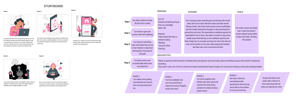
Now that we had focus and our Fluffy we were able to move forward writing a storyboard and User Journey for Lift Up!
Our user is overwhelmed with life BUT struggled to find time to unwind and enjoy themselves. Lift Up helps them get into their body and clear their mind for a few moments during their day.
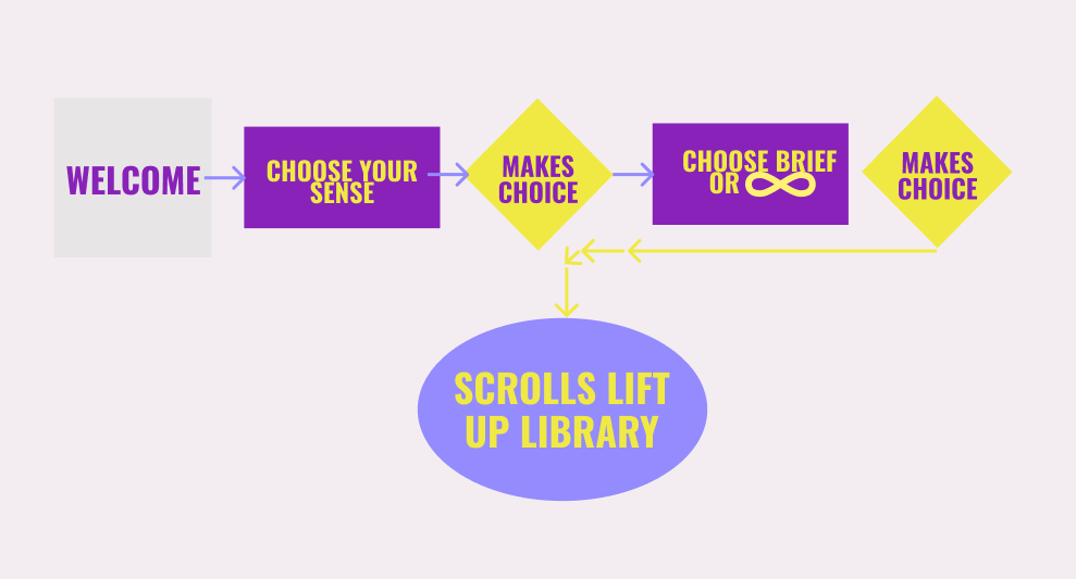
We kept our user flow simple. With the assistance of a mentor we were able to depict the straightforward path the User takes to enter the app and begin browsing the Lift Up library.
Our team wanted to offer two different kinds of sensory experiences for users. Experiences with a clear beginning, middle and end that last a few minutes or less, and INFINITE experiences that loop until the user ends them manually.
We looked at a number of direct and indirect competitors.
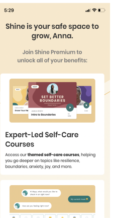
SHINE is a wellness app that offers the user a number of excellent resources. We LOVE their layout and that they structured their format like a vast library.
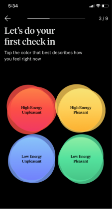
How We Feel has an excellent structure that we wanted to mimic. The app immediately engages you. It asks you as soon as you open it “How you’re feeling.” Regardless of whether or not you choose to continue using the app you’re forced to look inward and identify your emotions- bringing you into your body and mind.
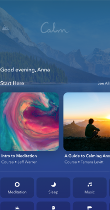
CALM has an impeccable vibe. The color pallet and overall feel is so pleasing. It welcomes and disarms the user. We wanted to establish we were decidedly NOT a meditation app. The apps that focus on meditation do it very well. From interviews we also learned meditation is intimidating to some people who deal with anxiety so we veered away from Calm’s layout and structure.
TikTok
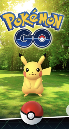
Pokemon Go
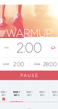
C25K
For INDIRECT COMPETITORS we looked at TikTok, Pokemon Go and C25K.
Although TikTok is not a wellness app there is a lot of wellness content available on the app. Scrolling through videos to unwind is a more and more common practice for busy individuals. The format TikTok follows (scrolling through videos until you decide to stop) is one we wanted to replicate.
Pokemon Go is an excellent example of the kind of playful immersive, AR gaming experience we want Lift Up to emulate.
C25k is a running app that engages the user immediately- much like How We Feel- it gets you started right away and plays music, lists your goals and gives you time limits to help guide you on your running journey. We also looked at characters like the “LUMA” from Nintendo as an example of the kind of cute, friendly character we want representing the app.
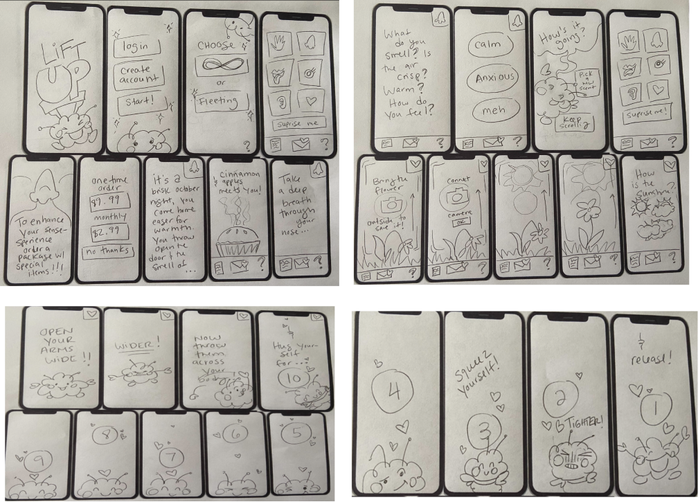
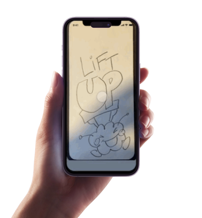
As a team we did A TON of sketching and paper prototyping throughout our iterating process. Sketching was our primary way of communicating and building on our design ideas since they combined so many kinds of interfaces. I personally did pages and pages of sketching when brainstorming experiences to bring Lift Up to life.
Below you will see a collection of sketches I did for our Mid-Fi Prototype.
We began prototyping in Invision.
For this first iteration we included cute animals and a mix of brief physical challenges and playful, soothing games.
We received very positive feedback on the overall concept but discovered where we needed to better guide the user.
We were able to move on to a Mid-Fi prototype quickly because of the time we spent sketching.
In Mid-Fi testing of the prototype we learned a lot about where to focus.
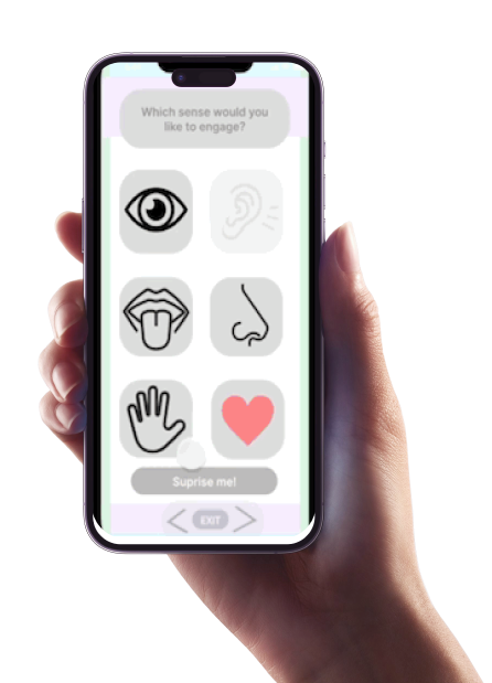
Users did not follow some of the guidelines we established. The lack of text made it difficult to choose an experience.
The Mid-Fi design was not accessible in many ways and had a lot of design issues that needed to be rectified in future iterations.
I began working on the Hi-Fidelity version of Lift Up!
I started with a few different design concepts.
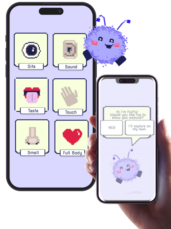
I wanted the look and feel of the app to be playful and joyful! The overall design aims to awaken the User’s inner child.
This design was inspired by the original Super Mario Bros. Nintendo video game.
I developed a few different designs for Lift Up’s final interface.
This design was meant to feel a bit more adult and refined.
When conducting A/B testing the more playful design styled after early 90s style video games was much preferred by User’s.
In addition to playing with the overall design I did a few different versions of Lift Up’s beloved mascot “Fluffy”. In the next steps of the app’s development I’d love to flesh out a version of Lift Up made in this style to test agains the early Nintendo styled one.
Thank you for taking the time to review my case study, as I hope you can tell a lot of hard work and love went into putting it together for you! If you have questions or would like to connect you can find my contact info below.